Meet the visitors behind the numbers
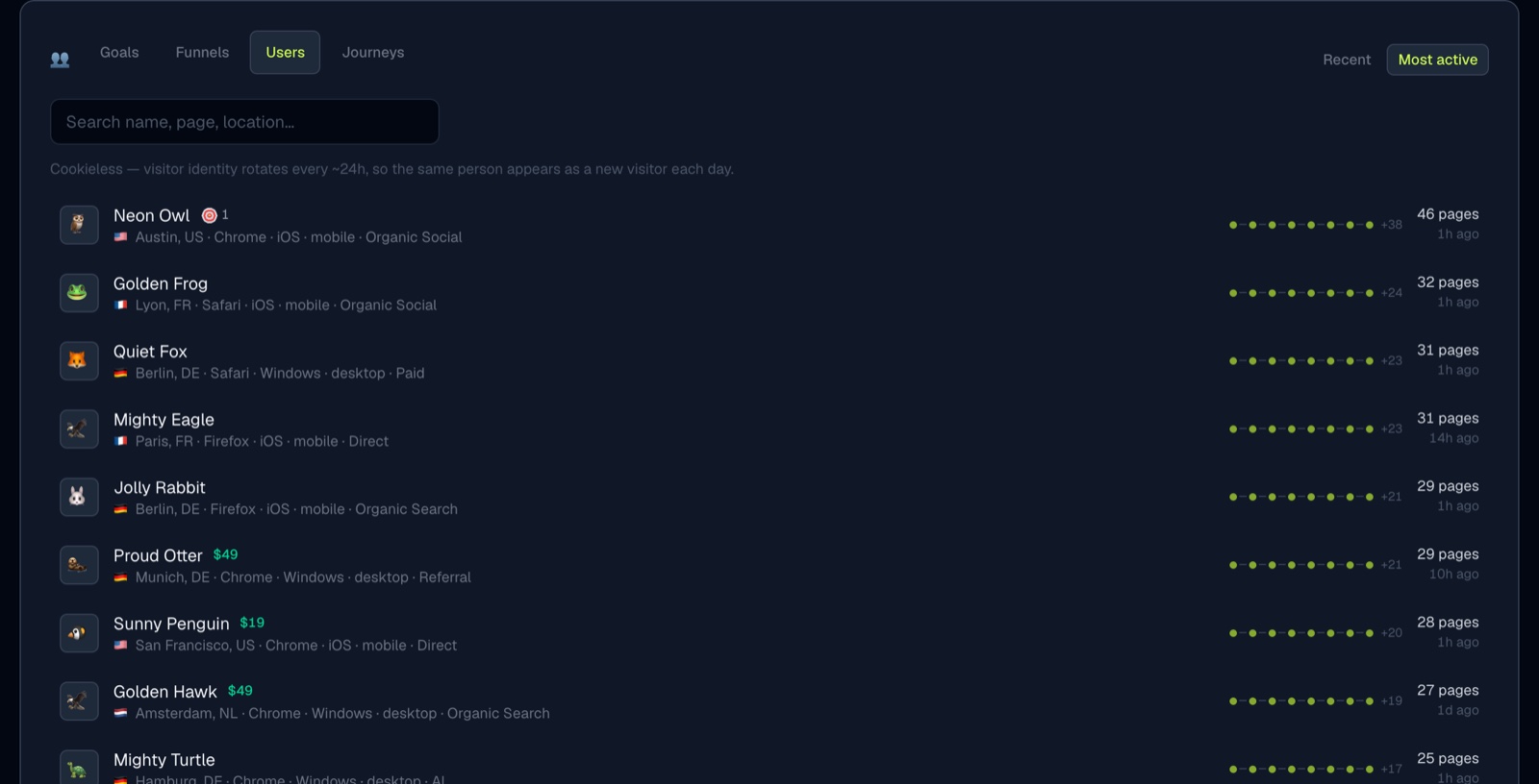
Every card on your dashboard tells you how many. None of them told you who. The conversions panel has two new tabs that do.
Users
Users lists the visitors themselves, one row each, with the name and avatar you already see in the live ticker. Where they came from, what they are using, how many pages they read, what they spent, and when they were last around.
The row also carries a small trail of dots, one per page they viewed in order. Hover a dot to see the page. It is the quickest way to tell someone who bounced apart from someone who read your whole blog.
Search narrows the list by name, page, or location. Click any visitor to open their full journey.
Journeys
Journeys answers the question the funnel chart cannot: how long did this actually take? Pick a goal, or a payment if your revenue is attributed, and you get one row per person who got there, with the source that brought them in, the page they landed on, and the time from first visit to conversion. The footer gives you the median, so you know whether a four-hour journey is normal for your site or remarkable.
Where the numbers stop
Time to convert is measured from the visitor's first pageview inside the range you have selected, so a wider range reports longer journeys. And on a cookieless site, visitor identity rotates roughly every 24 hours by design. A person who comes back tomorrow arrives as a new visitor. If you want journeys that span days, switch that site to cookie mode in Settings.
Both tabs respect the filters at the top of the dashboard, so you can look at just the visitors from one country, one campaign, or one landing page.
Analytics that plays like a game. Free for 14 days, no card.
Start free trial →